
Trinity Bread & Grain
Branding
Tools: Procreate, Adobe Illustrator
Project Goal: Develop a new logo for Trinity Bread & Grain, a small business offering healthy alternatives to store-bought bread.
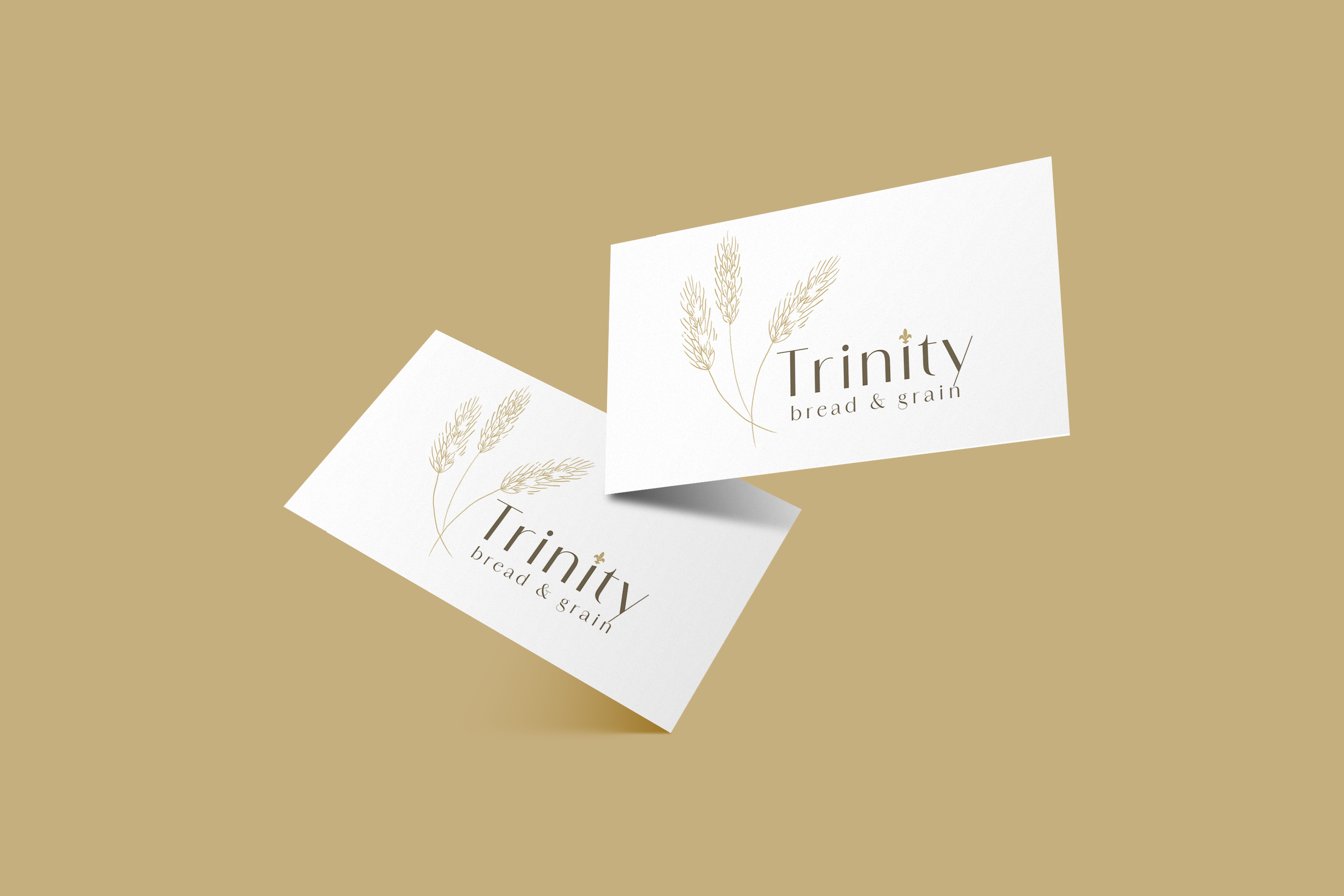
Process: To begin this design process, I got in contact with the owner of the business to discuss what she was looking for in a logo. She provided me with an image of an antique platter that she owns featuring a hand-drawn wheat design and informed me that she loved the platter and was currently using an image of it as her logo, so she would love to have a design featuring three wheat shoots inspired by the platter to highlight the “Trinity” part of her business’ name. Upon getting this information, I designed multiple variations of a potential wordmark logo inspired by the platter’s design.
Result: The final product features three shoots of wheat appearing to peacefully blow in the wind alongside the business name, “Trinity Bread & Grain”. To accompany the wheat design, I also included the fleur-de-lis used in the platter design within the logo by implementing it as the tittle of one “i” in “Trinity”. Altogether, the final logo portrays a sense of simplicity, peace, and sophistication, all meant to point back to the business’ goal of offering simple, better alternatives to typical bread offerings in stores.
