Helvetica Spotlight
UX/UI, Print, Branding
Tools: Adobe Illustrator, Figma
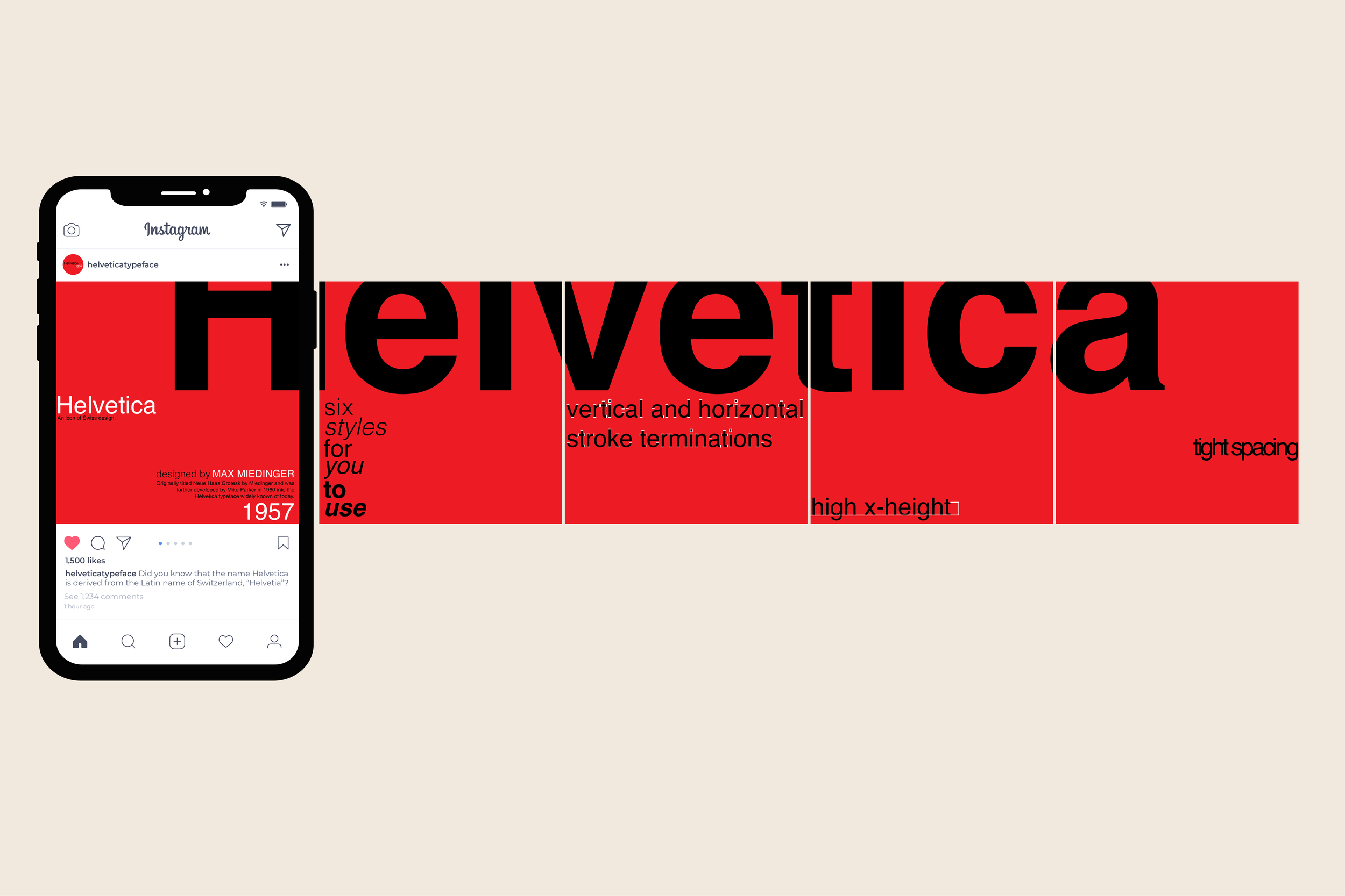
Project Goal: Highlight the defining features of the Helvetica typeface and market it via a poster, an Instagram carousel, and a website, maintaining a consistent aesthetic across all three mediums.
Process: A vast majority of the design process for this project involved research into the history of Helvetica. As I explored its iconic place in Swiss design as well as its unique features, I designed a brand for the typeface across print and digital mediums to hypothetically market it, first designing the poster to then incorporate its aesthetic into the carousel and website.
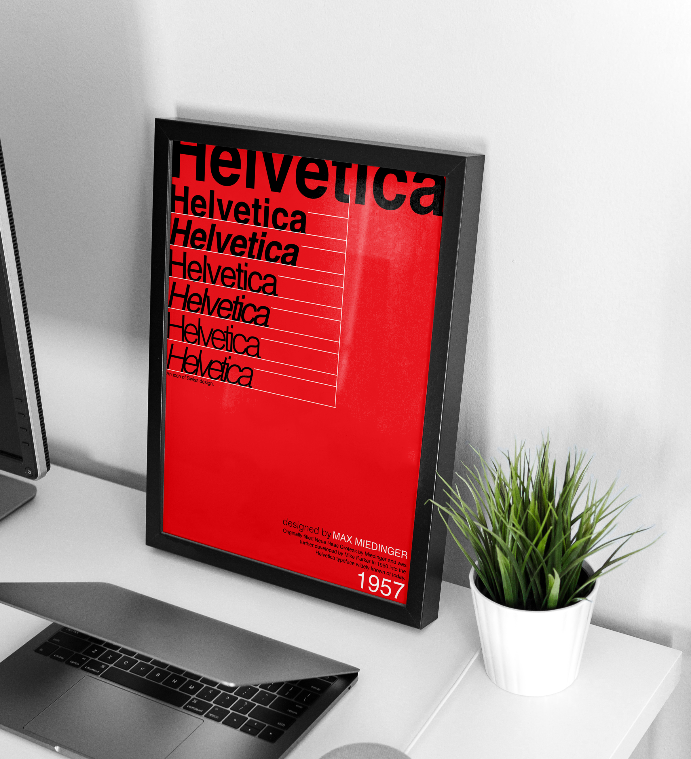
Result: The final products in this series are heavily inspired by the style of Swiss design as Helvetica has been iconically used within it. Bold, high contrast colors, a large amount of vacant space, and simple lines were used to not only reflect Swiss design, but also to bring out the qualities of Helvetica I wanted to focus on including its six styles, vertical and horizontal stroke terminations, high x-height, and tight spacing.
Poster Design