
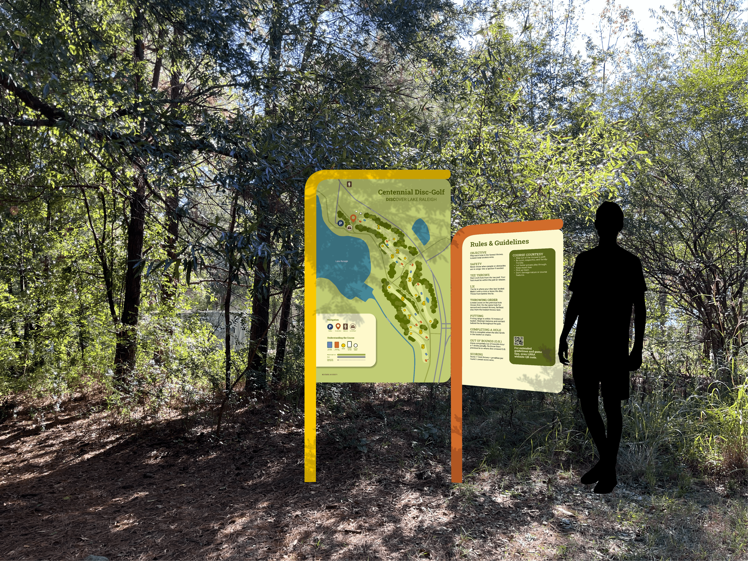
LRRA Disc Golf Course Rebrand
Reviving a play experience with clarity and cohesion.
Team | 3 People
Tools Used | Figma, Adobe Illustrator, Adobe Photoshop, Adobe Premiere Pro
Timeline | 5 Weeks
Project Overview
The Lake Raleigh Recreation Area (LRRA) disc golf course rebrand is meant to visualize the potential that a well-loved campus amenity has. Located on NC State’s Centennial campus within Lake Raleigh Woods, the disc golf course was in need of new wayfinding and a new visual identity to allow the beauty of the course to shine through and to create a more seamless experience for users.
-
The Problem
Poor, unclear wayfinding, run down equipment, and a lack of visual identity made the LRRA disc golf course feel disjointed from the polished beauty of NC State’s Centennial Campus and Lake Raleigh Woods. Not only did students using the course find it unwelcoming, but they also found it unclear and difficult to enjoy due to the lack of clarity while playing a game.
-
The Solution
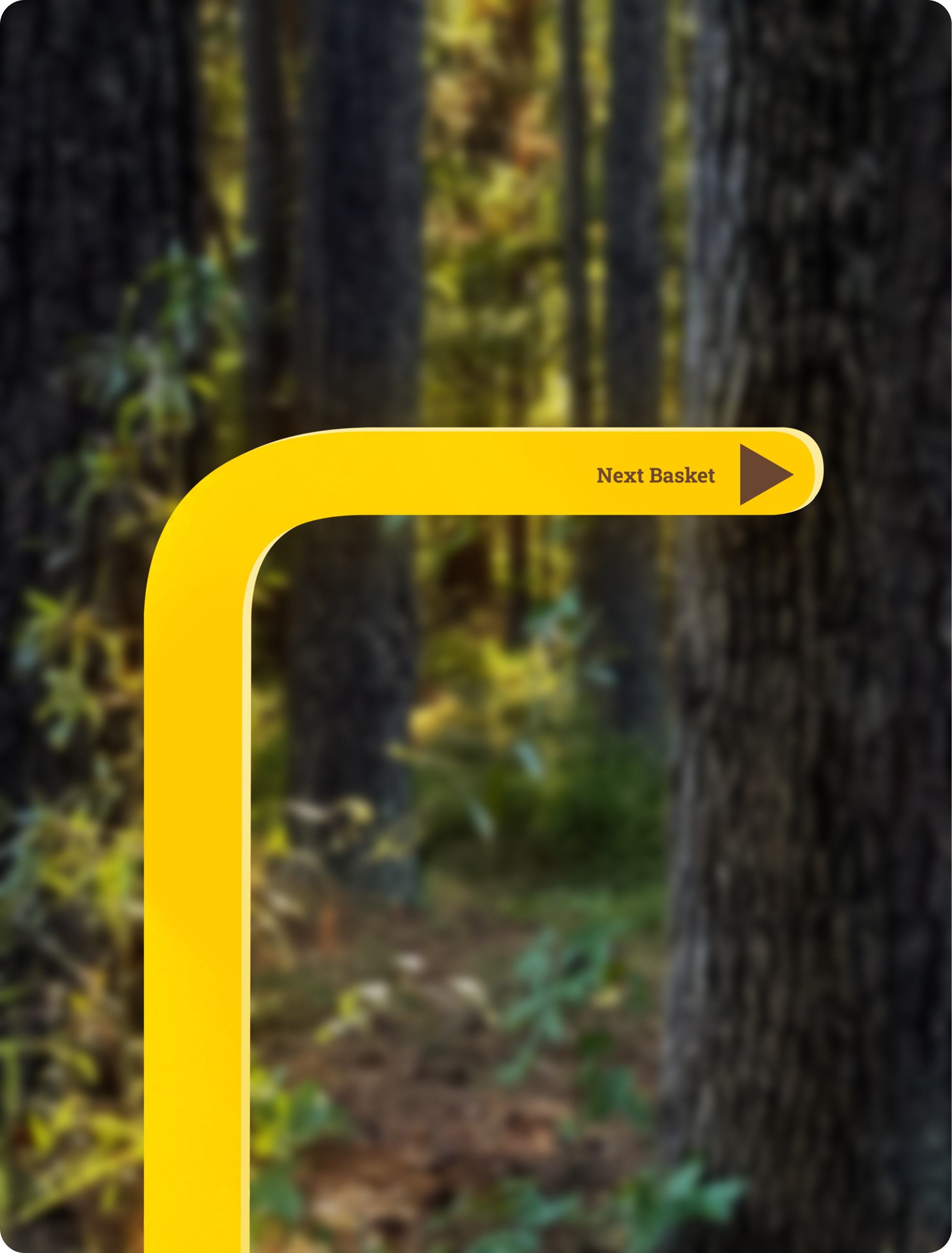
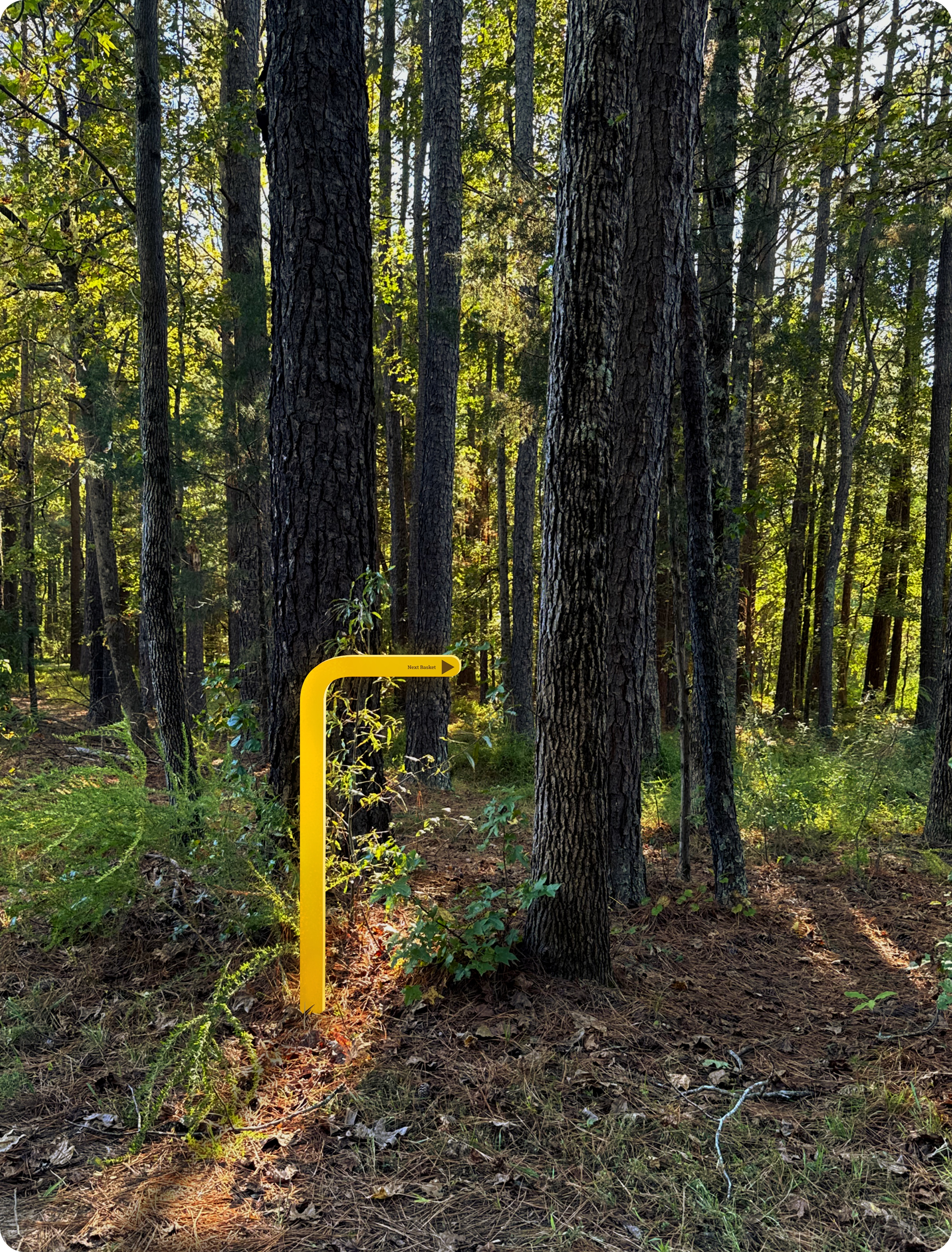
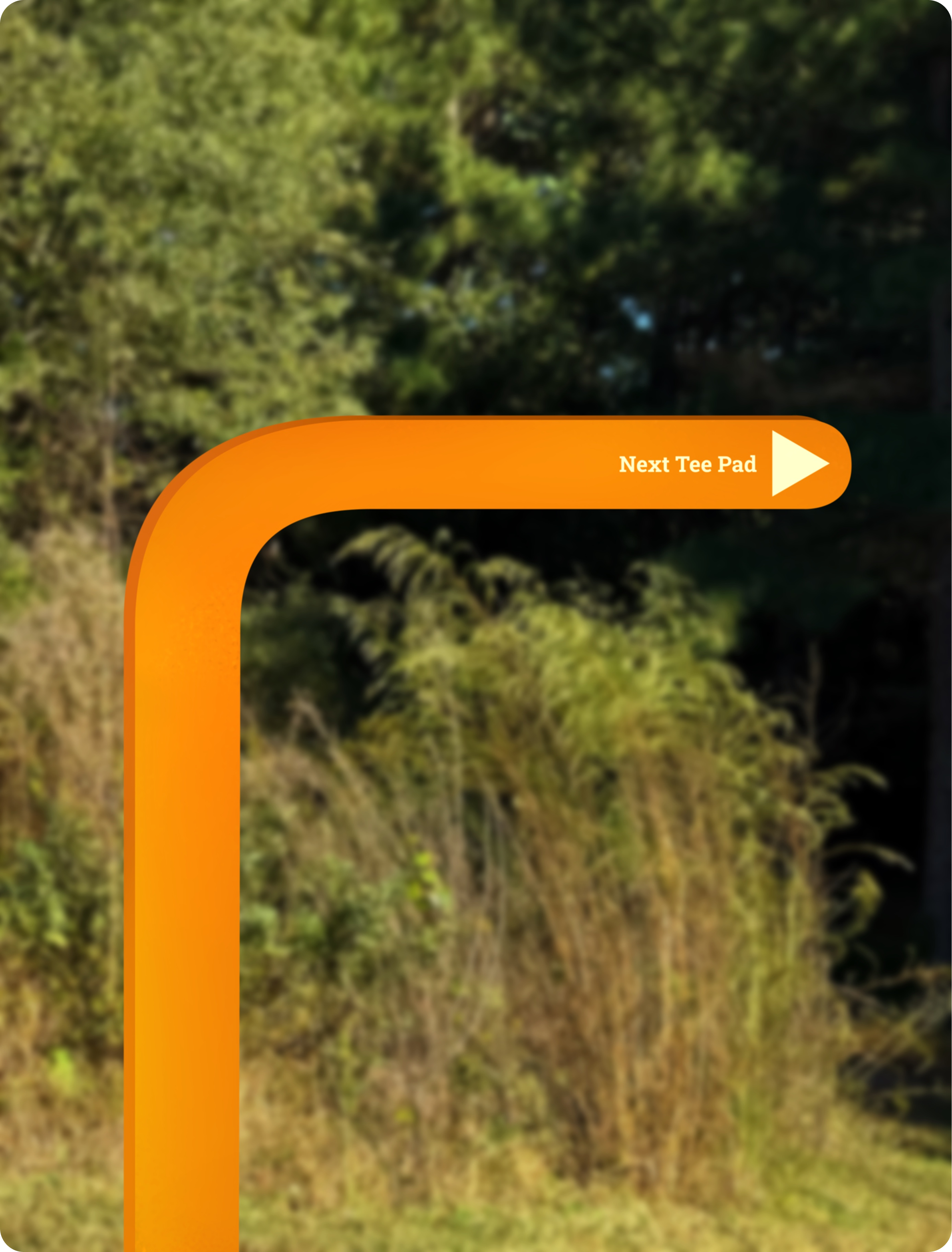
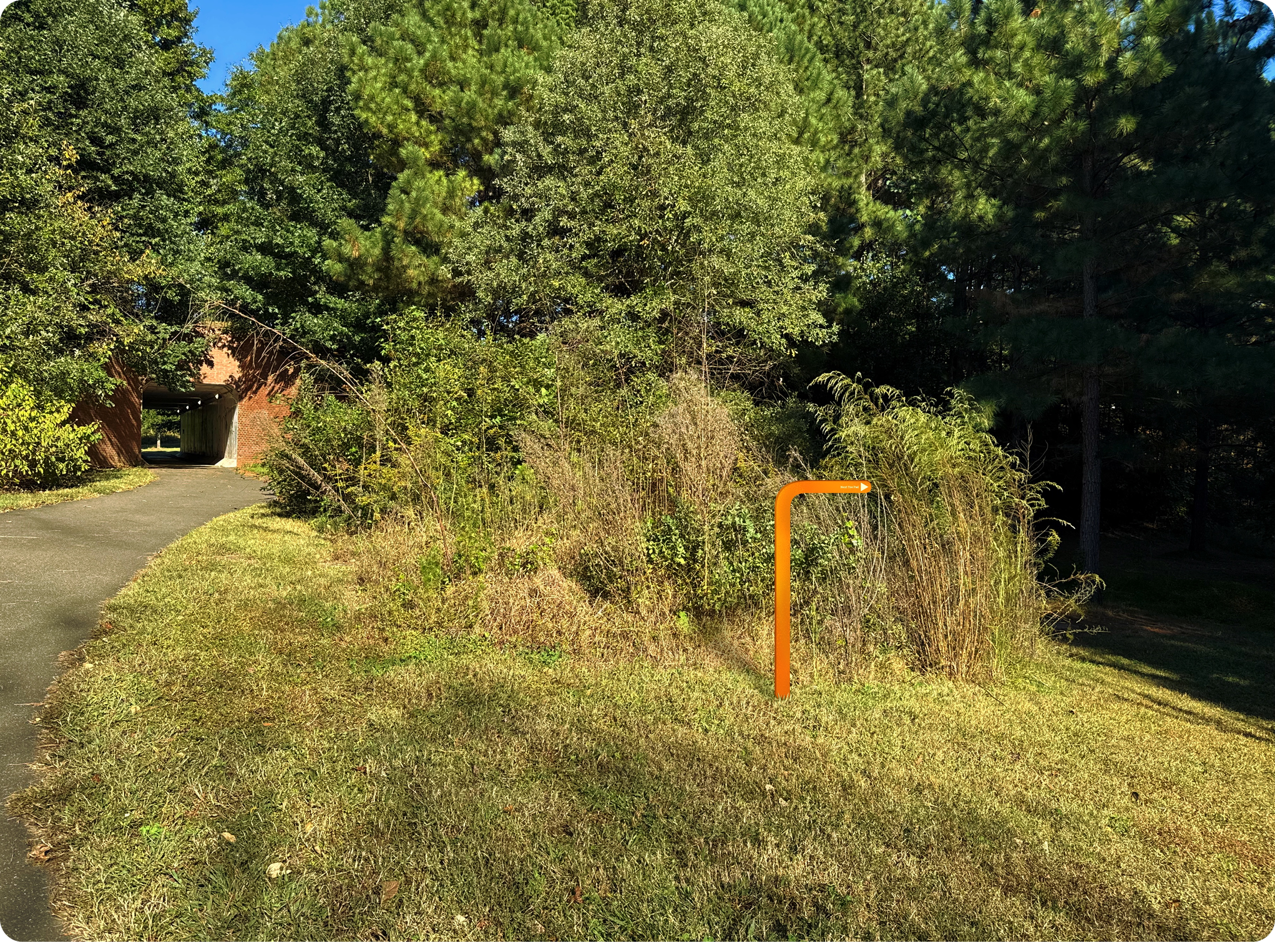
My team strove to improve the course by giving it a branding facelift and by taking extra measures to improve its navigational clarity. More signage, detailed, easy-to-read instructions and maps, and a clear color coding system combined with a cohesive brand bring this course to life and help it live up to its fullest potential, once again providing students with a seamless play experience.
My Role
-
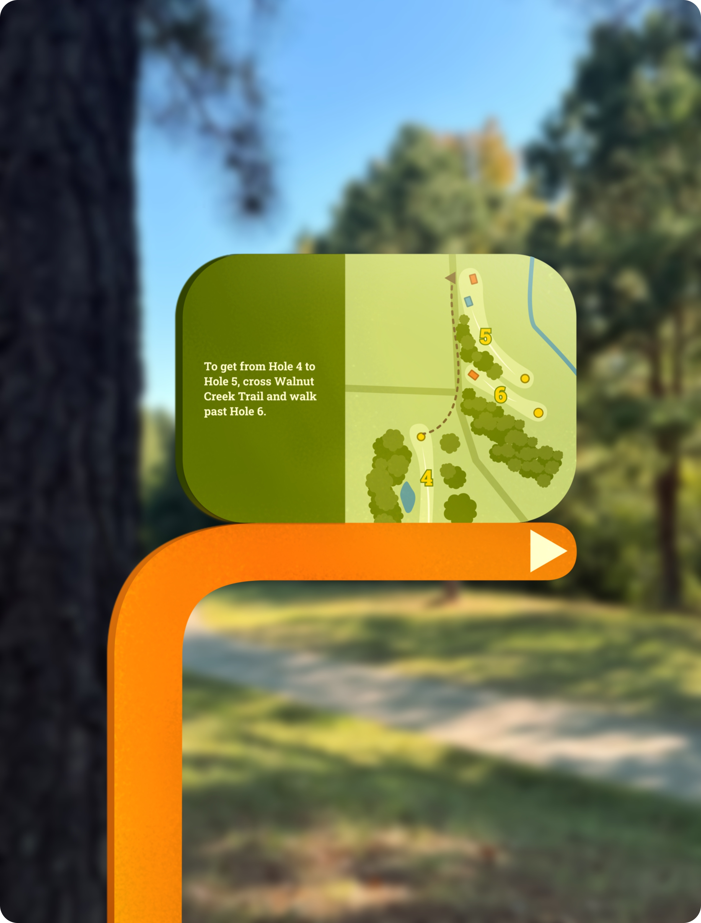
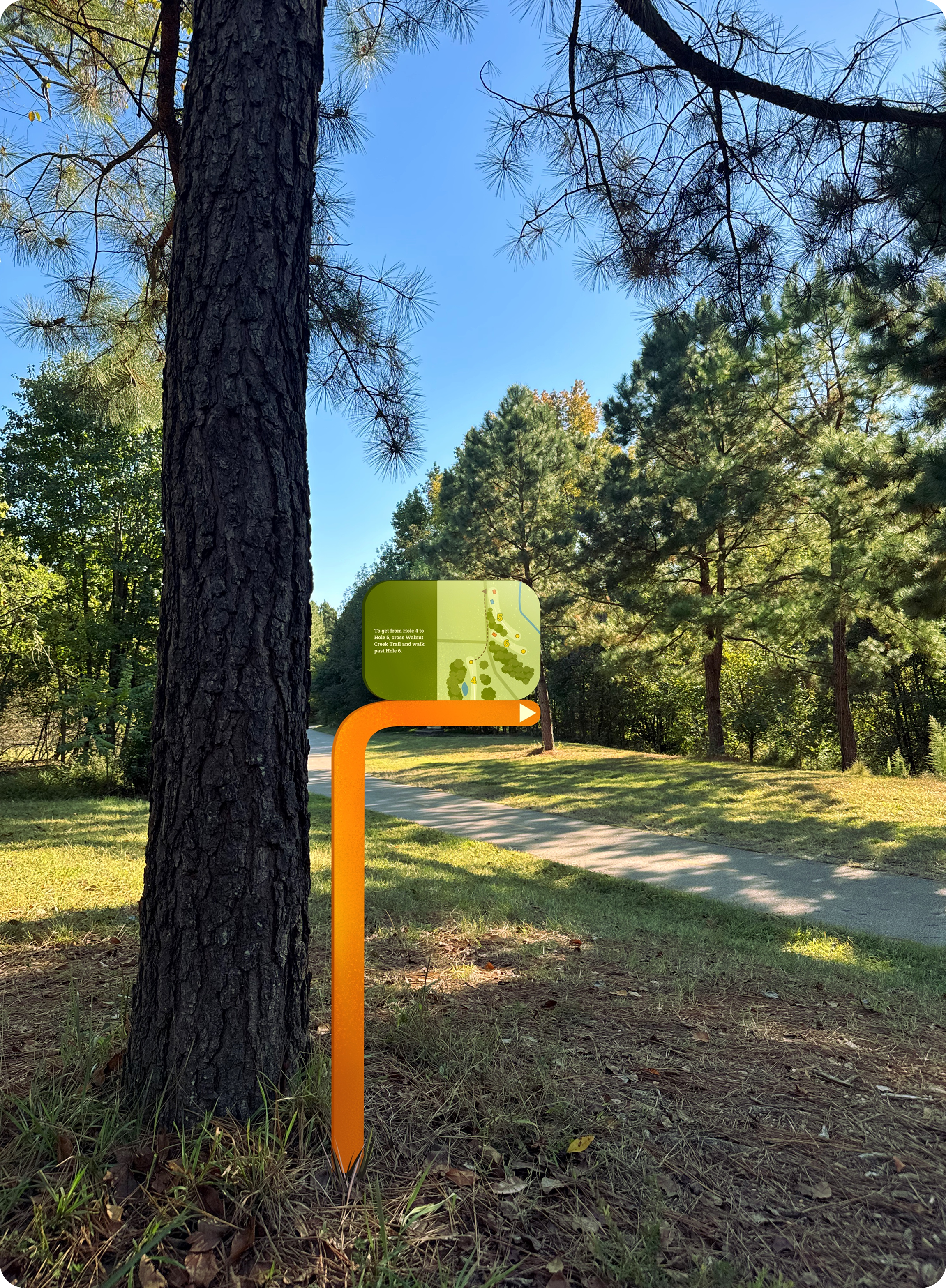
For certain areas throughout the disc golf course where a lot of space was between holes, we found that special signage would be helpful to guide users along the course. I took on the design of the maps and text for this special instance signage.
-
Part of showcasing this design to the LRRA clients was to film a promotional video of our redesign being used. I edited the video footage together and recorded the voiceover after storyboarding and filming with my team.
-
Throughout this project’s duration, I collaborated with my two teammates during every part of the design process. This included persona curation, journey map creation, presentation slide designs, mockup creation, and general feedback throughout the process.
Research
We began by visiting the LRRA course in-person and experiencing the course ourselves. Immediately we noticed that compared to other disc golf courses in Raleigh such as Diavolo and Fairview Park, the user experience was much less refined at the NC State course. NC State’s course lacked a consistent visual identity. There was also only one wayfinding sign for the entire course that directed to one hole and the fishing pier, and the rest of the course had to be navigated by spotting caution tape at some holes or by using the digital map that offered little clarification regarding how best to travel through the area.
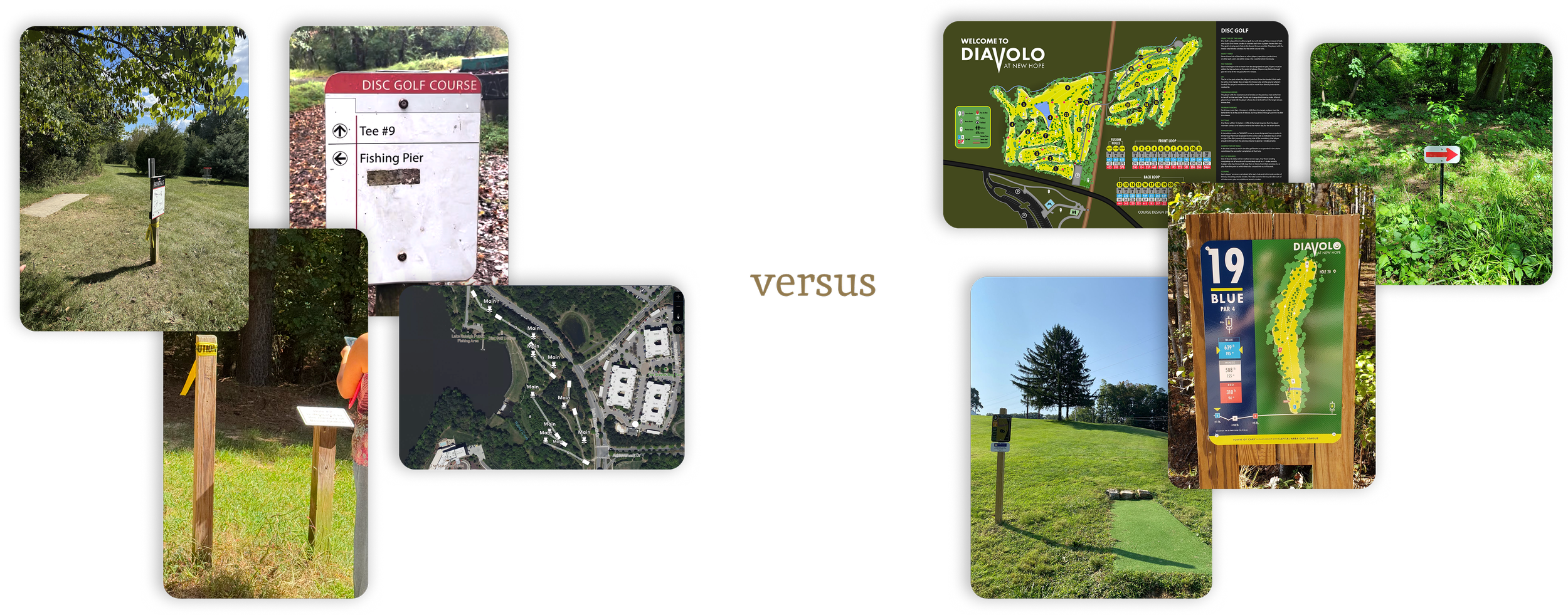
Upon interviewing three students before, during, and after their playing experience, our observations were supported through their feedback. A few quotes from these interviews that guided our direction were. . .
“It’s pretty neat, just confusing at times in terms of where to go.”
— Wesley B. | 21
“Signage with par information and maps would be helpful at each hole.”
— Mason | 21
“I’ve been here before so I knew where to go, but it would definitely be hard for a newcomer to navigate.”
— Daniel K. | 22
Alongside these insights, we found that all of the players we interviewed saw the setting of the course as one of their biggest draws to it. Being embedded within the woods and being surrounded by nature was a unique feature of this specific course, and we wanted to lean into that as we designed a new brand for it.
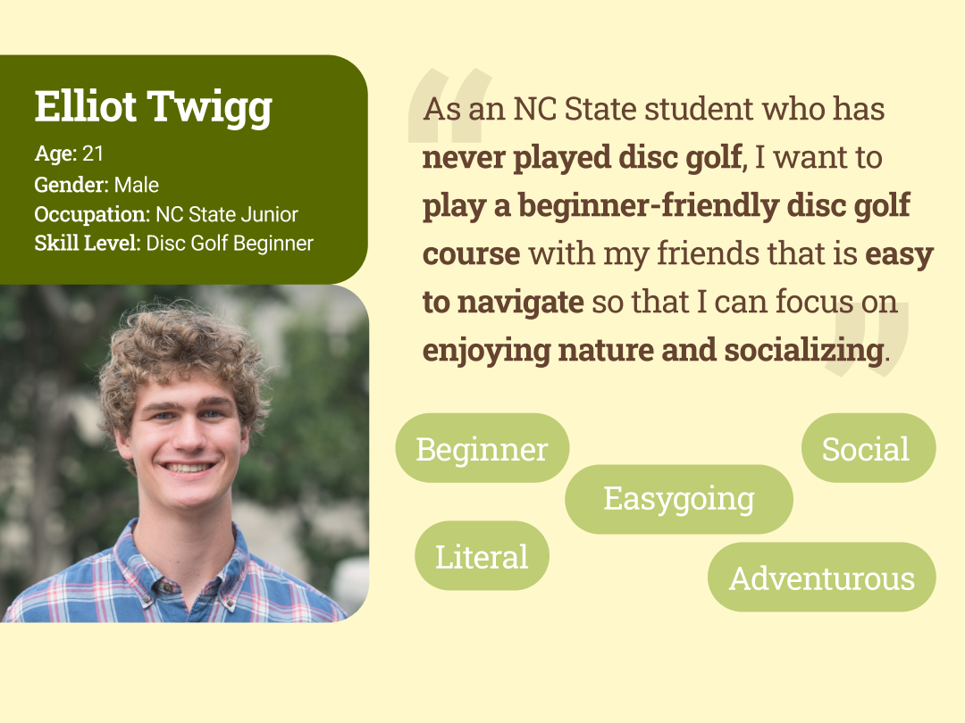
Meet Elliot
Based on our interview findings, Elliot Twigg was formed. He is a beginner-level disc golf player who wants to be able to easily navigate a new course in order to have the most enjoyable experience possible with his friends.
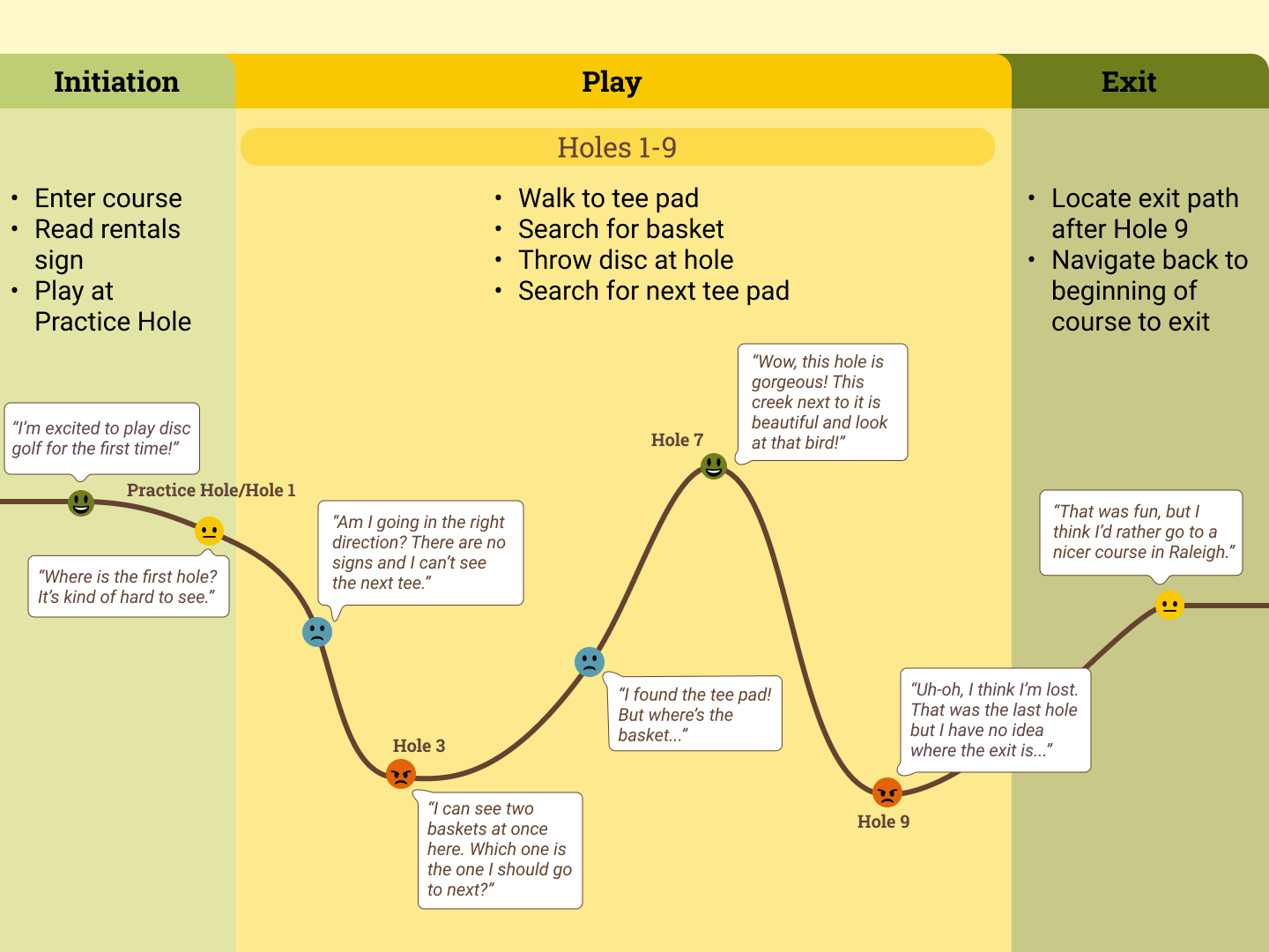
Elliot’s Journey
We mapped out Elliot’s journey with the current LRRA disc golf course and found that the primary pain points revolved around a lack of clarity. Certain holes had less visibility which warranted more signage in those areas for better direction. Certain tee pads were farther away from baskets than others which also warranted more wayfinding.
Design Process
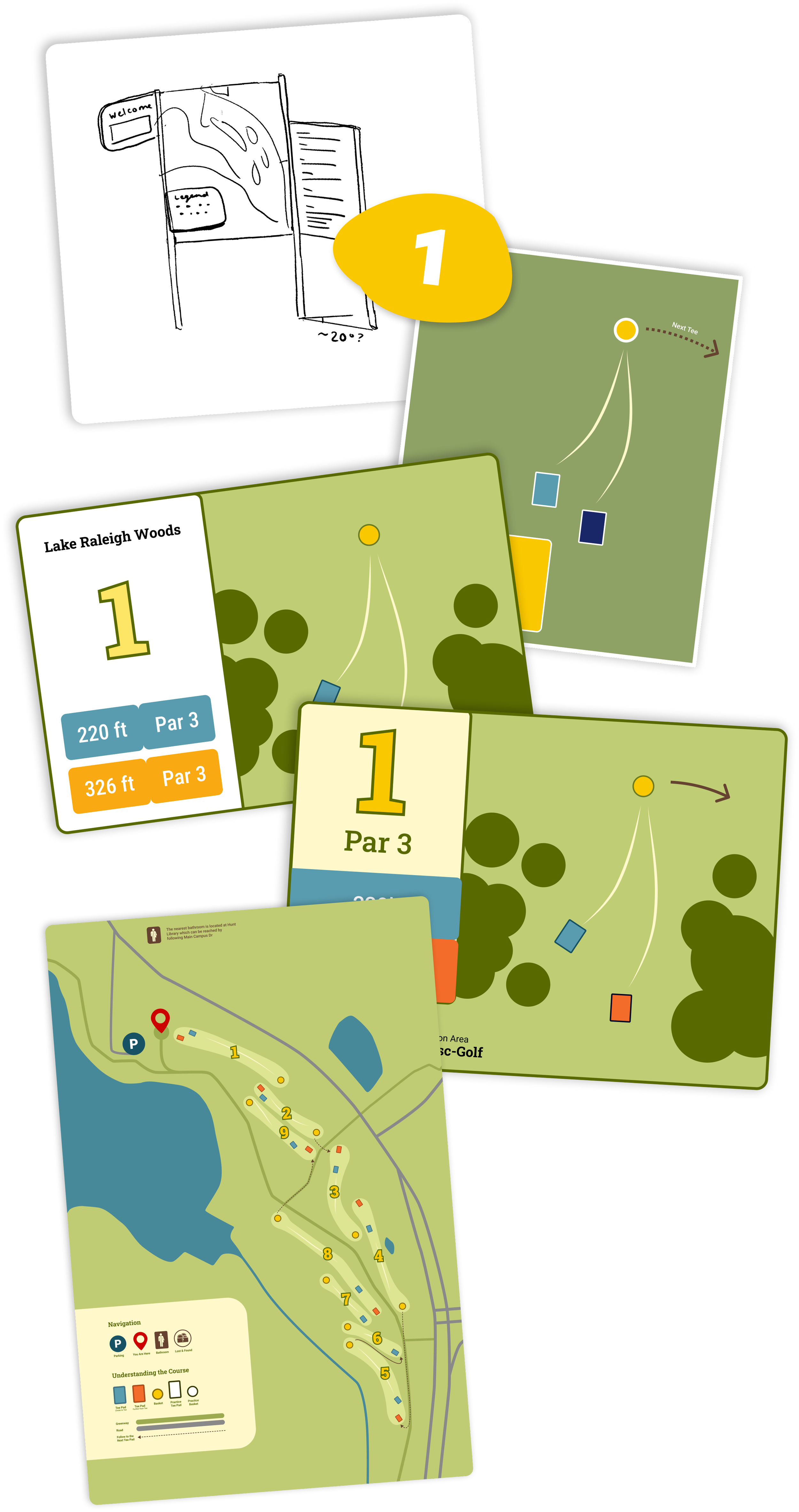
Signage Ideation
Before diving into a new look for the course, we needed to establish the best system for signage throughout the course. We sketched and played with many different hole, tee pad, and directional sign variations that would best cater to a disc golf player’s needs, regardless of their expertise.
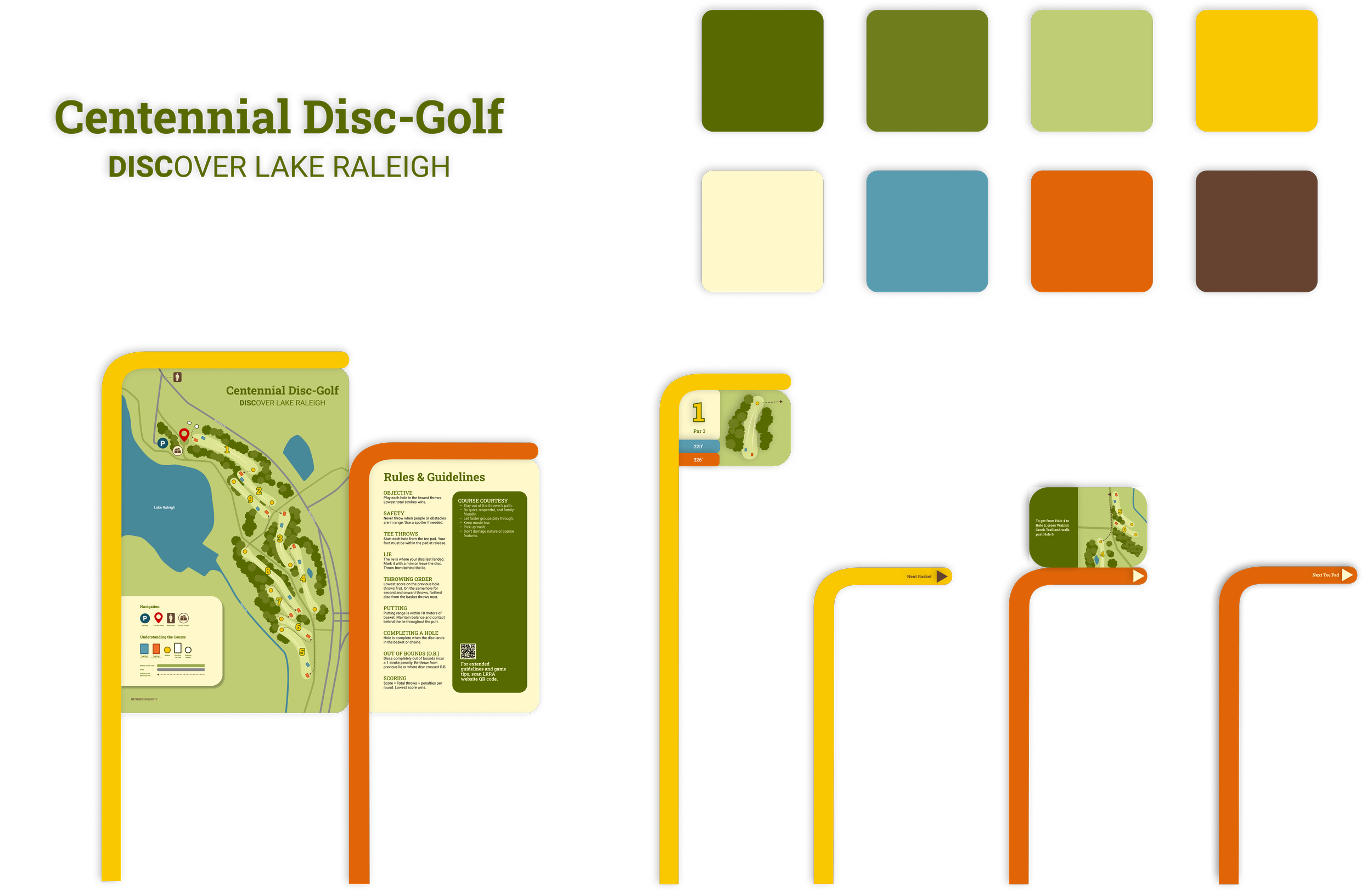
A Visual Identity
Something the original course was lacking was consistency in visuals and signage. After establishing what kind of signage would be most helpful, we moved on to building a new brand proposal that allowed for clarity, association with NC State’s existing brand, and that complemented the beautiful natural environment students loved about the course.
Final Product
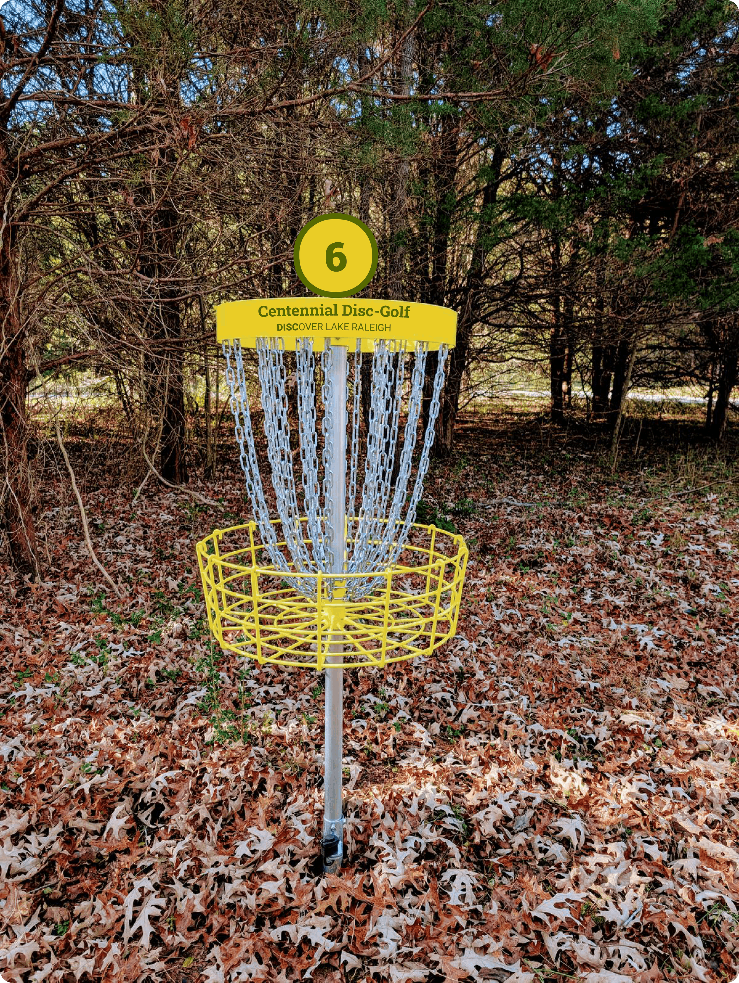
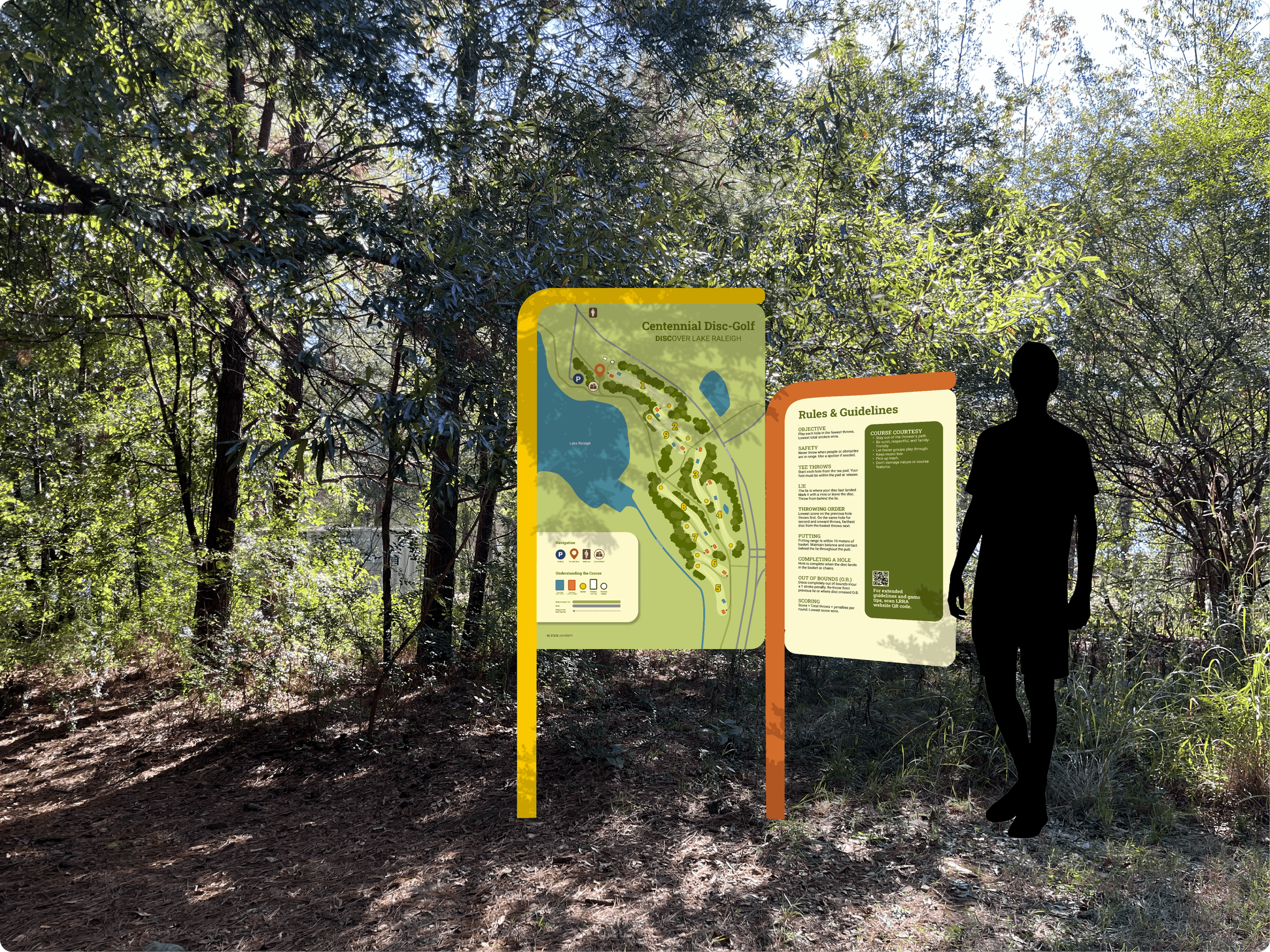
The final redesigned course is entitled “Centennial Disc-Golf: Discover Lake Raleigh”. This name combined with a color palette that reflects both nature and NC State’s Centennial campus gives the course a cohesive identity. Not only does it serve as a place to play, but also a place to discover the nature you are surrounded by. With fresh maps, signage, and wayfinding, our rebrand effectively imagined how new life, clarity, and enjoyment could be breathed back into this beautiful course.
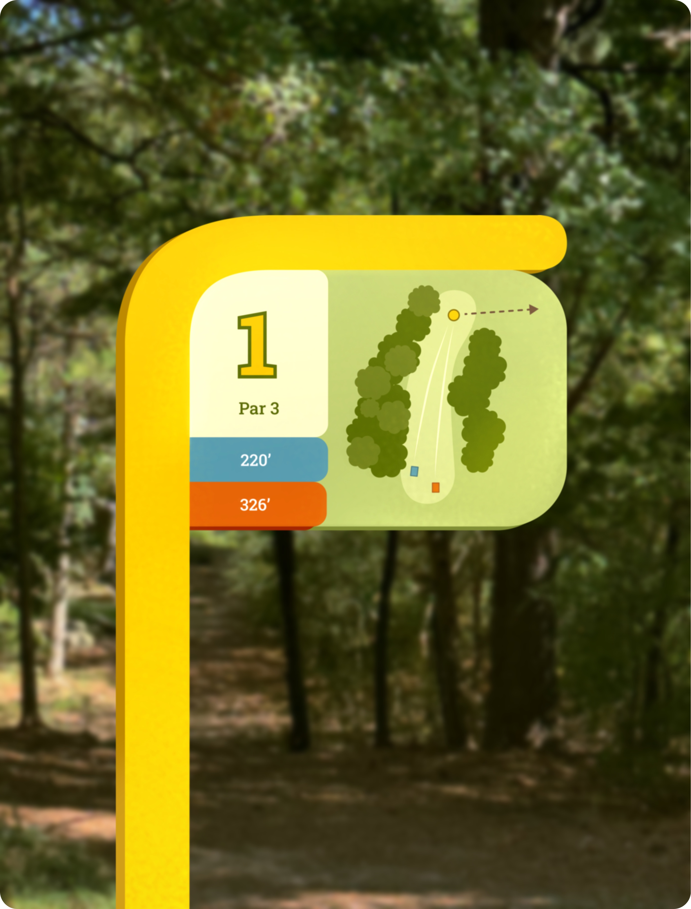
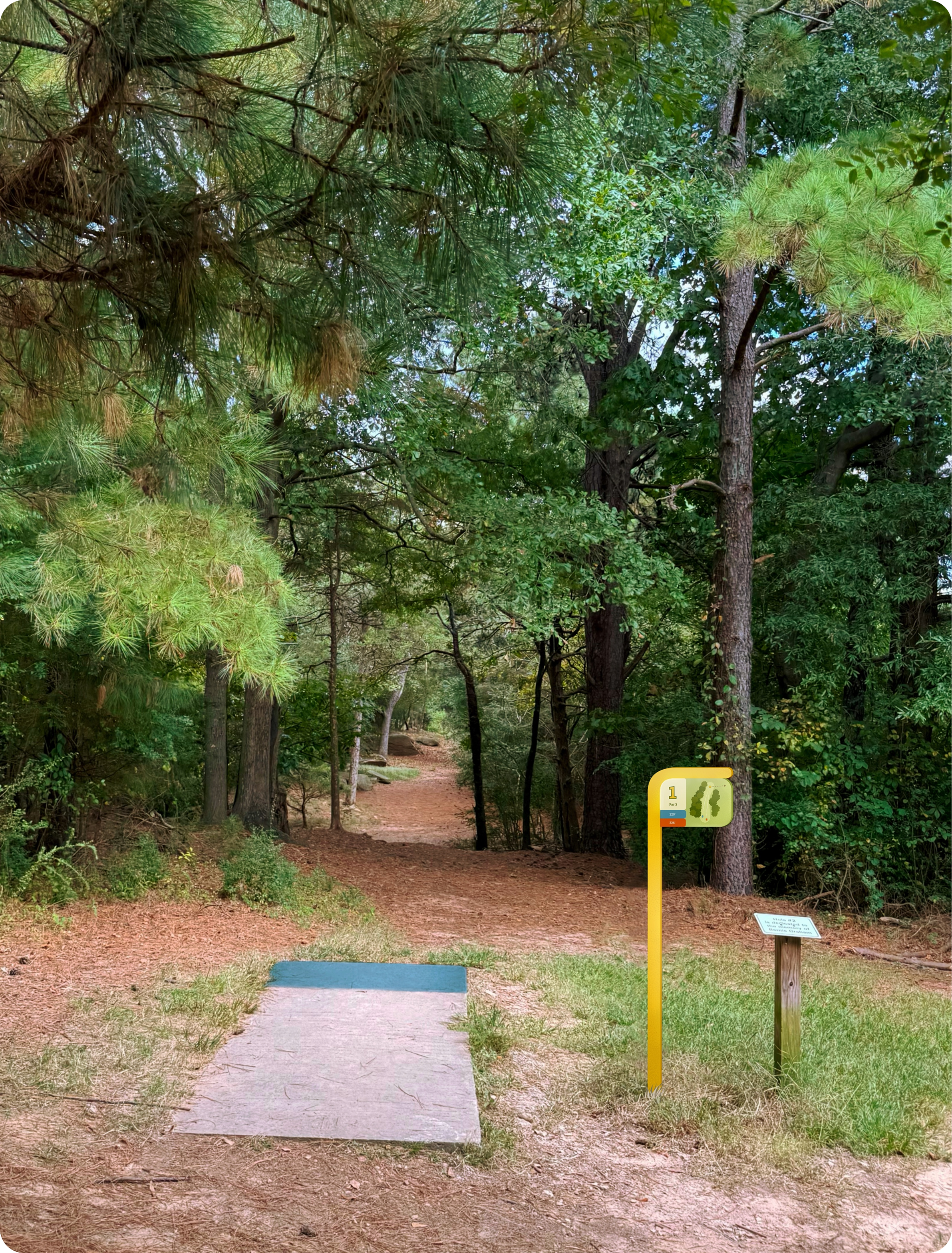
Promotional Video
See our redesign in action with this short advertisement for Centennial Disc-Golf: Discover Lake Raleigh.